Common Structure
View objects expose a number of fields, they are optional unless specified otherwise.
name(mandatory)- only useful as a mnemonic/description of the view when looking for one in a list of some sort
model- the model linked to the view, if applicable (it doesn’t for QWeb views)
priorityclient programs can request views by
id, or by(model, type). For the latter, all the views for the right type and model will be searched, and the one with the lowestprioritynumber will be returned (it is the “default view”).priorityalso defines the order of application during view inheritancearch- the description of the view’s layout
groups_idMany2manyfield to the groups allowed to view/use the current viewinherit_id- the current view’s parent view, see Inheritance, unset by default
mode- inheritance mode, see Inheritance. If
inherit_idis unset themodecan only beprimary. Ifinherit_idis set,extensionby default but can be explicitly set toprimary application- website feature defining togglable views. By default, views are always applied
Inheritance
View matching
- if a view is requested by
(model, type), the view with the right model and type,mode=primaryand the lowest priority is matched - when a view is requested by
id, if its mode is notprimaryits closest parent with modeprimaryis matched
View resolution
Resolution generates the final arch for a requested/matched primary
view:
- if the view has a parent, the parent is fully resolved then the current view’s inheritance specs are applied
- if the view has no parent, its
archis used as-is - the current view’s children with mode
extensionare looked up and their inheritance specs are applied depth-first (a child view is applied, then its children, then its siblings)
The result of applying children views yields the final arch
Inheritance specs
Inheritance specs are comprised of an element locator, to match the inherited element in the parent view, and children element that will be used to modify the inherited element.
There are three types of element locators for matching a target element:
- An
xpathelement with anexprattribute.expris an XPath expression2 applied to the currentarch, the first node it finds is the match - a
fieldelement with anameattribute, matches the firstfieldwith the samename. All other attributes are ignored during matching - any other element: the first element with the same name and identical
attributes (ignoring
positionandversionattributes) is matched
The inheritance spec may have an optional position attribute specifying
how the matched node should be altered:
inside(default)- the content of the inheritance spec is appended to the matched node
replace- the content of the inheritance spec replaces the matched node.
Any text node containing only
$0within the contents of the spec will be replaced by a complete copy of the matched node, effectively wrapping the matched node. after- the content of the inheritance spec is added to the matched node’s parent, after the matched node
before- the content of the inheritance spec is added to the matched node’s parent, before the matched node
attributesthe content of the inheritance spec should be
attributeelements with anameattribute and an optional body:- if the
attributeelement has a body, a new attributed named after itsnameis created on the matched node with theattributeelement’s text as value - if the
attributeelement has no body, the attribute named after itsnameis removed from the matched node. If no such attribute exists, an error is raised
- if the
A view’s specs are applied sequentially.
Lists
The root element of list views is <tree>3. The list view’s
root can have the following attributes:
editableby default, selecting a list view’s row opens the corresponding form view. The
editableattributes makes the list view itself editable in-place.Valid values are
topandbottom, making new records appear respectively at the top or bottom of the list.The architecture for the inline form view is derived from the list view. Most attributes valid on a form view’s fields and buttons are thus accepted by list views although they may not have any meaning if the list view is non-editable
default_orderoverrides the ordering of the view, replacing the model’s default order. The value is a comma-separated list of fields, postfixed by
descto sort in reverse order:<tree default_order="sequence,name desc">
colorsDeprecated since version 9.0: replaced by
decoration-{$name}fontsDeprecated since version 9.0: replaced by
decoration-{$name}decoration-{$name}allow changing the style of a row’s text based on the corresponding record’s attributes.
Values are Python expressions. For each record, the expression is evaluated with the record’s attributes as context values and if
true, the corresponding style is applied to the row. Other context values areuid(the id of the current user) andcurrent_date(the current date as a string of the formyyyy-MM-dd).{$name}can bebf(font-weight: bold),it(font-style: italic), or any bootstrap contextual color (danger,info,muted,primary,successorwarning).create,edit,delete- allows disabling the corresponding action in the view by setting the
corresponding attribute to
false limit- the default size of a page. It should be a positive integer
on_writeonly makes sense on an
editablelist. Should be the name of a method on the list’s model. The method will be called with theidof a record after having created or edited that record (in database).The method should return a list of ids of other records to load or update.
stringalternative translatable label for the view
Deprecated since version 8.0: not displayed anymore
Possible children elements of the list view are:
Forms
Form views are used to display the data from a single record. Their root
element is <form>. They are composed of regular HTML with additional
structural and semantic components.
Structural components
Structural components provide structure or “visual” features with little logic. They are used as elements or sets of elements in form views.
notebookdefines a tabbed section. Each tab is defined through a
pagechild element. Pages can have the following attributes:string(required)- the title of the tab
accesskey- an HTML accesskey
attrs- standard dynamic attributes based on record values
groupused to define column layouts in forms. By default, groups define 2 columns and most direct children of groups take a single column.
fielddirect children of groups display a label by default, and the label and the field itself have a colspan of 1 each.The number of columns in a
groupcan be customized using thecolattribute, the number of columns taken by an element can be customized usingcolspan.Children are laid out horizontally (tries to fill the next column before changing row).
Groups can have a
stringattribute, which is displayed as the group’s titlenewline- only useful within
groupelements, ends the current row early and immediately switches to a new row (without filling any remaining column beforehand) separator- small horizontal spacing, with a
stringattribute behaves as a section title sheet- can be used as a direct child to
formfor a narrower and more responsive form layout header- combined with
sheet, provides a full-width location above the sheet itself, generally used to display workflow buttons and status widgets
Semantic components
Semantic components tie into and allow interaction with the Flectra system. Available semantic components are:
buttoncall into the Flectra system, similar to list view buttons. In addition, the following attribute can be specified:
special- for form views opened in dialogs:
saveto save the record and close the dialog,cancelto close the dialog without saving.
fieldrenders (and allow edition of, possibly) a single field of the current record. Possible attributes are:
name(mandatory)- the name of the field to render
widget- fields have a default rendering based on their type
(e.g.
Char,Many2one). Thewidgetattributes allows using a different rendering method and context. options- JSON object specifying configuration option for the field’s widget (including default widgets)
classHTML class to set on the generated element, common field classes are:
oe_inline- prevent the usual line break following fields
oe_left,oe_right- floats the field to the corresponding direction
oe_read_only,oe_edit_only- only displays the field in the corresponding form mode
oe_no_button- avoids displaying the navigation button in a
Many2one oe_avatar- for image fields, displays images as “avatar” (square, 90x90 maximum size, some image decorations)
groups- only displays the field for specific users
on_changecalls the specified method when this field’s value is edited, can generate update other fields or display warnings for the user
Deprecated since version 8.0: Use
flectra.api.onchange()on the modelattrs- dynamic meta-parameters based on record values
domain- for relational fields only, filters to apply when displaying existing records for selection
context- for relational fields only, context to pass when fetching possible values
readonly- display the field in both readonly and edition mode, but never make it editable
required- generates an error and prevents saving the record if the field doesn’t have a value
nolabel- don’t automatically display the field’s label, only makes sense if the
field is a direct child of a
groupelement placeholder- help message to display in empty fields. Can replace field labels in complex forms. Should not be an example of data as users are liable to confuse placeholder text with filled fields
mode- for
One2many, display mode (view type) to use for the field’s linked records. One oftree,form,kanbanorgraph. The default istree(a list display) help- tooltip displayed for users when hovering the field or its label
filename- for binary fields, name of the related field providing the name of the file
password- indicates that a
Charfield stores a password and that its data shouldn’t be displayed
Business Views guidelines
Business views are targeted at regular users, not advanced users. Examples are: Opportunities, Products, Partners, Tasks, Projects, etc.
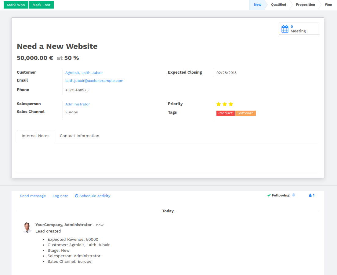
In general, a business view is composed of
- a status bar on top (with technical or business flow),
- a sheet in the middle (the form itself),
- a bottom part with History and Comments.
Technically, the new form views are structured as follows in XML:
<form>
    <header> ... content of the status bar  ... </header>
    <sheet>  ... content of the sheet       ... </sheet>
    <div class="oe_chatter"> ... content of the bottom part ... </div>
</form>
The Status Bar
The purpose of the status bar is to show the status of the current record and the action buttons.

The Status
Uses the statusbar widget, and shows the current state in red. States
common to all flows (for instance, a sale order begins as a quotation, then we
send it, then it becomes a full sale order, and finally it is done) should be
visible at all times but exceptions or states depending on particular sub-flow
should only be visible when current.


The states are shown following the order used in the field (the list in a
selection field, etc). States that are always visible are specified with the
attribute statusbar_visible.
<field name="state" widget="statusbar"
    statusbar_visible="draft,sent,sale,done,cancel" />
The Sheet
All business views should look like a printed sheet:
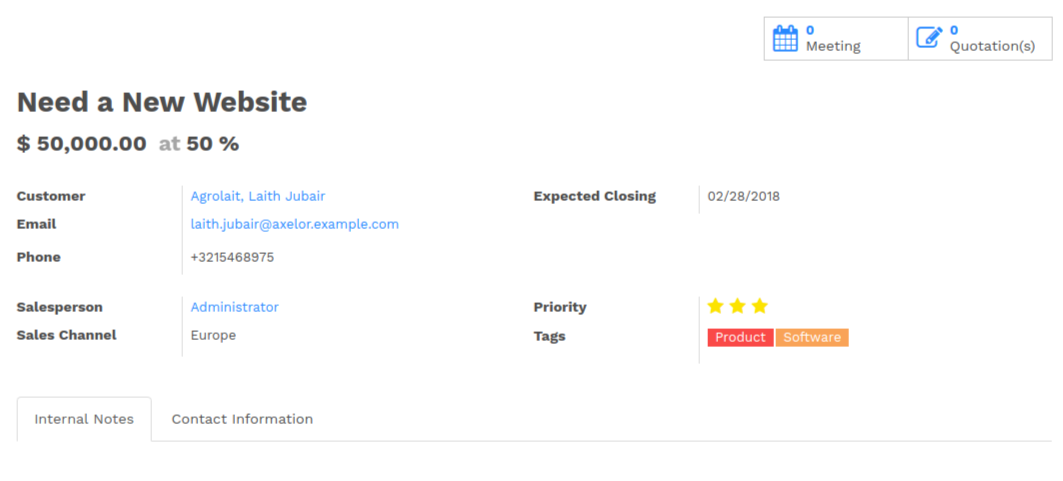
- Elements inside a
<form>or<page>do not define groups, elements inside them are laid out according to normal HTML rules. They content can be explicitly grouped using<group>or regular<div>elements. - By default, the element
<group>defines two columns inside, unless an attributecol="n"is used. The columns have the same width (1/n th of the group’s width). Use a<group>element to produce a column of fields. To give a title to a section, add a
stringattribute to a<group>element:<group string="Time-sensitive operations">
this replaces the former use of
<separator string="XXX"/>.- The
<field>element does not produce a label, except as direct children of a<group>element1. Use<label for="field_name>to produce a label of a field.
Sheet Headers
Some sheets have headers with one or more fields, and the labels of those fields are only shown in edit mode.
| View mode | Edit mode |
|---|---|
 |  |
Use HTML text, <div>, <h1>, <h2>… to produce nice headers, and
<label> with the class oe_edit_only to only display the field’s label
in edit mode. The class oe_inline will make fields inline (instead of
blocks): content following the field will be displayed on the same line rather
than on the line below it. The form above is produced by the following XML:
<label for="name" class="oe_edit_only"/>
<h1><field name="name" placeholder="e.g. Product Pricing"/></h1>
<h2 class="o_row">
    <div>
        <label for="planned_revenue" class="oe_edit_only" />
        <div class="o_row">
            <field name="company_currency" invisible="1"/>
            <field name="planned_revenue" widget='monetary' options="{'currency_field': 'company_currency'}"/>
            <span class="oe_grey"> at </span>
        </div>
    </div>
    <div>
        <label for="probability" class="oe_edit_only"/>
        <div class="o_row">
            <field name="probability" widget="integer"/>
            <span>%%</span>
        </div>
    </div>
</h2>
Groups and Titles
A column of fields is now produced with a <group> element, with an
optional title.
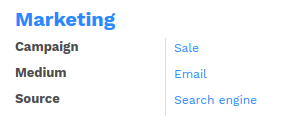
<group string="Marketing">
   <field name="campaign_id"/>
   <field name="medium_id"/>
   <field name="source_id"/>
</group>
It is recommended to have two columns of fields on the form. For this, simply
put the <group> elements that contain the fields inside a top-level
<group> element.
To make view extension simpler, it is
recommended to put a name attribute on <group> elements, so new fields
can easily be added at the right place.
Special Case: Subtotals
Some classes are defined to render subtotals like in invoice forms:
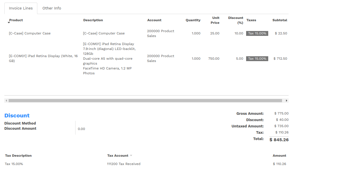
<group class="oe_subtotal_footer oe_right">
   <field name="amount_untaxed"/>
   <field name="amount_tax"/>
   <field name="amount_total" class="oe_subtotal_footer_separator"/>
   <field name="payments_widget" colspan="2" nolabel="1" widget="payment"/>
   <field name="residual" class="oe_subtotal_footer_separator" attrs="{'invisible': [('state', '=', 'draft')]}"/>
   <field name="reconciled" invisible="1"/>
   <field name="outstanding_credits_debits_widget" colspan="2" nolabel="1" widget="payment" attrs="{'invisible': [('state', 'not in', 'open')]}"/>
</group>
Placeholders and Inline Fields
Sometimes field labels make the form too complex. One can omit field labels, and instead put a placeholder inside the field. The placeholder text is visible only when the field is empty. The placeholder should tell what to place inside the field, it must not be an example as they are often confused with filled data.
One can also group fields together by rendering them “inline” inside an
explicit block element like <div>. This allows grouping semantically
related fields as if they were a single (composite) fields.
The following example, taken from the Leads form, shows both placeholders and inline fields (zip and city).
| Edit mode | View mode |
|---|---|
 |  |
<group>
    <label for="street" string="Address"/>
    <div>
        <field name="street" placeholder="Street..."/>
        <field name="street2"  placeholder="Street 2..."/>
        <div>
            <field name="zip" class="o_address_zip" placeholder="ZIP"/>
            <field name="city" class="o_address_city" placeholder="City"/>
        </div>
        <field name="state_id" placeholder="State"/>
        <field name="country_id" placeholder="Country"/>
    </div>
</group>
Images
Images, like avatars, By default avatars should be displayed on the left of the sheet. The product form looks like:
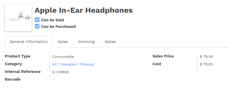
The form above contains a <sheet> element that starts with:
<field name="image_medium" widget="image" class="oe_avatar"/>
Configuration forms guidelines
Examples of configuration forms: Stages, Leave Type, etc. This concerns all menu items under Configuration of each application (like CRM/Configuration).

- no header (because no state, no workflow, no button)
- no sheet
Dialog forms guidelines
Example: “Create Invoice” from a sale order.
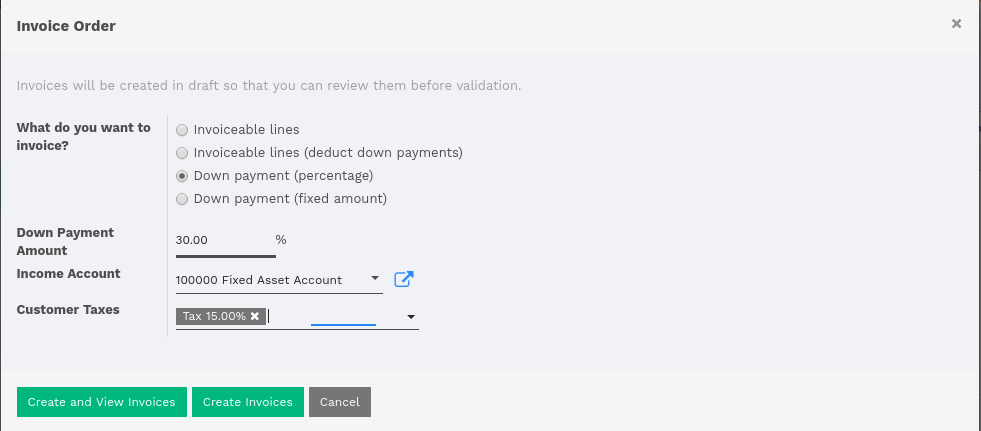
- avoid separators (the title is already in the popup title bar, so another separator is not relevant)
- action buttons must be highlighted (red)
- when there is a text area, use a placeholder instead of a label or a separator
Configuration Wizards guidelines
Example: Settings / Configuration / Sales.
- always in line (no popup)
- no sheet
- keep the cancel button (users cannot close the window)
- the button “Apply” must be red
Graphs
The graph view is used to visualize aggregations over a number of records or
record groups. Its root element is <graph> which can take the following
attributes:
type- one of
bar(default),pieandline, the type of graph to use stacked- only used for
barcharts. If present and set toTrue, stacks bars within a group
The only allowed element within a graph view is field which can have the
following attributes:
name(required)- the name of a field to use in a graph view. If used for grouping (rather than aggregating)
typeindicates whether the field should be used as a grouping criteria or as an aggregated value within a group. Possible values are:
row(default)- groups by the specified field. All graph types support at least one level of grouping, some may support more. For pivot views, each group gets its own row.
col- only used by pivot tables, creates column-wise groups
measure- field to aggregate within a group
interval- on date and datetime fields, groups by the specified interval (
day,week,month,quarteroryear) instead of grouping on the specific datetime (fixed second resolution) or date (fixed day resolution).
Warning
graph view aggregations are performed on database content, non-stored function fields can not be used in graph views
Pivots
The pivot view is used to visualize aggregations as a pivot table. Its root
element is <pivot> which can take the following attributes:
disable_linking- Set to
Trueto remove table cell’s links to list view. display_quantity- Set to
trueto display the Quantity column by default.
The elements allowed within a pivot view are the same as for the graph view.
Kanban
The kanban view is a kanban board visualisation: it displays records as “cards”, halfway between a list view and a non-editable form view. Records may be grouped in columns for use in workflow visualisation or manipulation (e.g. tasks or work-progress management), or ungrouped (used simply to visualize records).
The root element of the Kanban view is <kanban>, it can use the following
attributes:
default_group_by- whether the kanban view should be grouped if no grouping is specified via the action or the current search. Should be the name of the field to group by when no grouping is otherwise specified
default_order- cards sorting order used if the user has not already sorted the records (via the list view)
class- adds HTML classes to the root HTML element of the Kanban view
group_create- whether the “Add a new column” bar is visible or not. Default: true.
group_delete- whether groups can be deleted via the context menu. Default: true.
group_edit- whether groups can be edited via the context menu. Default: true.
quick_createwhether it should be possible to create records without switching to the form view. By default,
quick_createis enabled when the Kanban view is grouped, and disabled when not.Set to
trueto always enable it, and tofalseto always disable it.
Possible children of the view element are:
fielddeclares fields to use in kanban logic. If the field is simply displayed in the kanban view, it does not need to be pre-declared.
Possible attributes are:
name(required)- the name of the field to fetch
progressbardeclares a progressbar element to put on top of kanban columns.
Possible attributes are:
field(required)- the name of the field whose values are used to subgroup column’s records in the progressbar
colors(required)- JSON mapping the above field values to either “danger”, “warning” or “success” colors
sum_field(optional)- the name of the field whose column’s records’ values will be summed and displayed next to the progressbar (if omitted, displays the total number of records)
templatesdefines a list of QWeb templates. Cards definition may be split into multiple templates for clarity, but kanban views must define at least one root template
kanban-box, which will be rendered once for each record.The kanban view uses mostly-standard javascript qweb and provides the following context variables:
widget- the current
KanbanRecord(), can be used to fetch some meta-information. These methods are also available directly in the template context and don’t need to be accessed viawidget record- an object with all the requested fields as its attributes. Each field has
two attributes
valueandraw_value, the former is formatted according to current user parameters, the latter is the direct value from aread()(except for date and datetime fields that are formatted according to user’s locale) read_only_modeself-explanatory
buttons and fields
While most of the Kanban templates are standard QWeb, the Kanban view processes
field,buttonandaelements specially:- by default fields are replaced by their formatted value, unless they match specific kanban view widgets
buttons and links with a
typeattribute become perform Flectra-related operations rather than their standard HTML function. Possible types are:action,object- standard behavior for Flectra buttons, most attributes relevant to standard Flectra buttons can be used.
open- opens the card’s record in the form view in read-only mode
edit- opens the card’s record in the form view in editable mode
delete- deletes the card’s record and removes the card
If you need to extend the Kanban view, see :js:class::the JS API <KanbanRecord>.
Calendar
Calendar views display records as events in a daily, weekly or monthly
calendar. Their root element is <calendar>. Available attributes on the
calendar view are:
date_start(required)- name of the record’s field holding the start date for the event
date_stop- name of the record’s field holding the end date for the event, if
date_stopis provided records become movable (via drag and drop) directly in the calendar date_delay- alternative to
date_stop, provides the duration of the event instead of its end date (unit: day) color- name of a record field to use for color segmentation. Records in the same color segment are allocated the same highlight color in the calendar, colors are allocated semi-randomly. Displayed the display_name/avatar of the visible record in the sidebar
readonly_form_view_id- view to open in readonly mode
form_view_id- view to open when the user create or edit an event
event_open_popup- If the option ‘event_open_popup’ is set to true, then the calendar view will open events (or records) in a FormViewDialog. Otherwise, it will open events in a new form view (with a do_action)
quick_add- enables quick-event creation on click: only asks the user for a
nameand tries to create a new event with just that and the clicked event time. Falls back to a full form dialog if the quick creation fails all_day- name of a boolean field on the record indicating whether the corresponding event is flagged as day-long (and duration is irrelevant)
mode- Default display mode when loading the calendar.
Possible attributes are:
day,week,month <field>declares fields to aggregate or to use in kanban logic. If the field is simply displayed in the calendar cards.
Fields can have additional attributes:
invisible- use “True” to hide the value in the cards
avatar_field- only for x2many field, to display the avatar instead the display_name in the cards
write_modelandwrite_field- you can add a filter and save the result in the defined model, the filter is added in the sidebar
templatesdefines the QWeb template
calendar-box. Cards definition may be split into multiple templates for clarity which will be rendered once for each record.The kanban view uses mostly-standard javascript qweb and provides the following context variables:
widget- the current
KanbanRecord(), can be used to fetch some meta-information. These methods are also available directly in the template context and don’t need to be accessed viawidgetgetColorto convert in a color integergetAvatarsto convert in an avatar imagedisplayFieldslist of not invisible fields record- an object with all the requested fields as its attributes. Each field has
two attributes
valueandraw_value event- the calendar event object
format- format method to convert values into a readable string with the user parameters
fields- definition of all model fields parameters
user_context- self-explanatory
read_only_mode- self-explanatory
Gantt
Gantt views appropriately display Gantt charts (for scheduling).
The root element of gantt views is <gantt/>, it has no children but can
take the following attributes:
date_start(required)- name of the field providing the start datetime of the event for each record.
date_stopname of the field providing the end duration of the event for each record. Can be replaced by
date_delay. One (and only one) ofdate_stopanddate_delaymust be provided.If the field is
Falsefor a record, it’s assumed to be a “point event” and the end date will be set to the start datedate_delay- name of the field providing the duration of the event
duration_unit- one of
minute,hour(default),day,week,month,year default_group_by- name of a field to group tasks by
typeganttclassic gantt view (default)consolidatevalues of the first children are consolidated in the gantt’s taskplanningchildren are displayed in the gantt’s taskconsolidation- field name to display consolidation value in record cell
consolidation_maxdictionary with the “group by” field as key and the maximum consolidation value that can be reached before displaying the cell in red (e.g.
{"user_id": 100})Warning
The dictionnary definition must use double-quotes,
{'user_id': 100}is not a valid valuestring- string to display next to the consolidation value, if not specified, the label of the consolidation field will be used
fold_last_level- If a value is set, the last grouping level is folded
round_dnd_dates- enables rounding the task’s start and end dates to the nearest scale marks
drag_resize- resizing of the tasks, default is
true
Diagram
The diagram view can be used to display directed graphs of records. The root
element is <diagram> and takes no attributes.
Possible children of the diagram view are:
node(required, 1)Defines the nodes of the graph. Its attributes are:
object- the node’s Flectra model
shape- conditional shape mapping similar to colors and fonts in the list
view. The only valid shape is
rectangle(the default shape is an ellipsis) bgcolor- same as
shape, but conditionally maps a background color for nodes. The default background color is white, the only valid alternative isgrey.
arrow(required, 1)Defines the directed edges of the graph. Its attributes are:
object(required)- the edge’s Flectra model
source(required)Many2onefield of the edge’s model pointing to the edge’s source node recorddestination(required)Many2onefield of the edge’s model pointing to the edge’s destination node recordlabel- Python list of attributes (as quoted strings). The corresponding attributes’s values will be concatenated and displayed as the edge’s label
label- Explanatory note for the diagram, the
stringattribute defines the note’s content. Eachlabelis output as a paragraph in the diagram header, easily visible but without any special emphasis.
Search
Search views are a break from previous view types in that they don’t display content: although they apply to a specific model, they are used to filter other view’s content (generally aggregated views e.g. Lists or Graphs). Beyond that difference in use case, they are defined the same way.
The root element of search views is <search>. It takes no attributes.
Possible children elements of the search view are:
fieldfields define domains or contexts with user-provided values. When search domains are generated, field domains are composed with one another and with filters using AND.
Fields can have the following attributes:
name- the name of the field to filter on
string- the field’s label
operatorby default, fields generate domains of the form
[(name, operator, provided_value)]wherenameis the field’s name andprovided_valueis the value provided by the user, possibly filtered or transformed (e.g. a user is expected to provide the label of a selection field’s value, not the value itself).The
operatorattribute allows overriding the default operator, which depends on the field’s type (e.g.=for float fields butilikefor char fields)filter_domaincomplete domain to use as the field’s search domain, can use a
selfvariable to inject the provided value in the custom domain. Can be used to generate significantly more flexible domains thanoperatoralone (e.g. searches on multiple fields at once)If both
operatorandfilter_domainare provided,filter_domaintakes precedence.contextallows adding context keys, including the user-provided value (which as for
domainis available as aselfvariable). By default, fields don’t generate domains.Note
the domain and context are inclusive and both are generated if a
contextis specified. To only generate context values, setfilter_domainto an empty list:filter_domain="[]"groups- make the field only available to specific users
widget- use specific search widget for the field (the only use case in
standard Flectra 1.0 is a
selectionwidget forMany2onefields) domain- if the field can provide an auto-completion
(e.g.
Many2one), filters the possible completion results.
filtera filter is a predefined toggle in the search view, it can only be enabled or disabled. Its main purposes are to add data to the search context (the context passed to the data view for searching/filtering), or to append new sections to the search filter.
Filters can have the following attributes:
string(required)- the label of the filter
domain- an Flectra domain, will be appended to the action’s domain as part of the search domain
context- a Python dictionary, merged into the action’s domain to generate the search domain
name- logical name for the filter, can be used to enable it by default, can also be used as inheritance hook
help- a longer explanatory text for the filter, may be displayed as a tooltip
groups- makes a filter only available to specific users
Tip
Sequences of filters (without non-filters separating them) are treated as inclusively composited: they will be composed with
ORrather than the usualAND, e.g.<filter domain="[('state', '=', 'draft')]"/> <filter domain="[('state', '=', 'done')]"/>
if both filters are selected, will select the records whose
stateisdraftordone, but<filter domain="[('state', '=', 'draft')]"/> <separator/> <filter domain="[('delay', '<', 15)]"/>
if both filters are selected, will select the records whose
stateisdraftanddelayis below 15.separator- can be used to separates groups of filters in simple search views
group- can be used to separate groups of filters, more readable than
separatorin complex search views
Search defaults
Search fields and filters can be configured through the action’s context
using search_default_name keys. For fields, the value should be the
value to set in the field, for filters it’s a boolean value. For instance,
assuming foo is a field and bar is a filter an action context of:
{
  'search_default_foo': 'acro',
  'search_default_bar': 1
}
will automatically enable the bar filter and search the foo field for
acro.
QWeb
QWeb views are standard QWeb templates inside a view’s
arch. They don’t have a specific root element.
A QWeb view can only contain a single template4, and the template’s name must match the view’s complete (including module name) external id.
template should be used as a shortcut to define QWeb views.
hasclass(*classes) matches if the context node has
all the specified classes
