Chapter 1: Components
This chapter introduces the Owl framework, a tailor-made component system for Flectra. The main building blocks of OWL are components and templates.
In Owl, every part of user interface is managed by a component: they hold the logic and define the
templates that are used to render the user interface. In practice, a component is represented by a
small JavaScript class subclassing the Component class.
Example
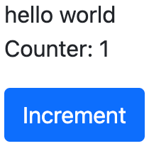
The Counter class implements a component that holds the internal state of a counter and defines
how it should be incremented.
const { Component, useState } = owl;

 class Counter extends Component {
     static template = "my_module.Counter";

     state = useState({ value: 0 });

     increment() {
         this.state.value++;
     }
 }
The Counter class specifies the name of the template to render. The template is written in XML
and defines a part of user interface.
<templates xml:space="preserve">
    <t t-name="my_module.Counter" owl="1">
        <p>Counter: <t t-esc="state.value"/></p>
        <button class="btn btn-primary" t-on-click="increment">Increment</button>
    </t>
</templates>
You maybe noticed the owl="1" temporary attribute, it allows Flectra to differentiate Owl
templates from the old JavaScript framework templates.
Let us take some time to get used to Owl itself. Below, you will find a series of exercises intended to quickly understand and practice the basics of Owl.
Goal
Here is an overview of what we are going to achieve in this chapter.
The solutions for each exercise of the chapter are hosted on the official Flectra tutorials repository.
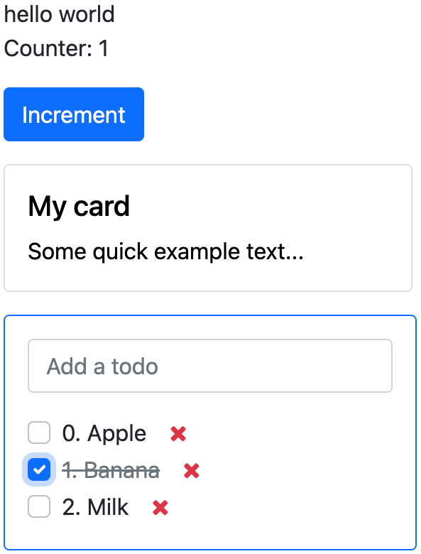
1. Displaying a counter
As a first exercise, let us implement a counter in the Playground component located in
owl_playground/static/src/. To see the result, you can go to the /owl_playground/playground
route with your browser.
Exercise
Modify
playground.jsso that it acts as a counter like in the example above. You will need to use the useState function so that the component is re-rendered whenever any part of the state object has been read by this component is modified.In the same component, create an
incrementmethod.Modify the template in
playground.xmlso that it displays your counter variable. Use t-esc to output the data.Add a button in the template and specify a t-on-click attribute in the button to trigger the
incrementmethod whenever the button is clicked.
See also
2. Extract counter in a component
For now we have the logic of a counter in the Playground component, let us see how to create a
sub-component from it.
Exercise
Extract the counter code from the
Playgroundcomponent into a newCountercomponent.You can do it in the same file first, but once it’s done, update your code to move the
Counterin its own file.Make sure the template is in its own file, with the same name.
Important
Don’t forget /** @flectra-module **/ in your JavaScript files. More information on this can
be found here.
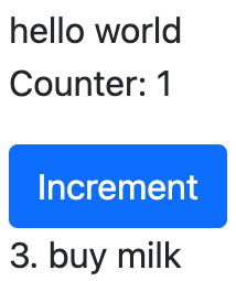
3. A todo component
We will create new components in owl_playground/static/src/ to keep track of a list of
todos. This will be done incrementally in multiple exercises that will introduce various concepts.
Exercise
Create a
Todocomponent that receive atodoobject in props, and display it. It should show something like 3. buy milk.Add the Bootstrap classes
text-mutedandtext-decoration-line-throughon the task if it is done. To do that, you can use dynamic attributesModify
owl_playground/static/src/playground.jsandowl_playground/static/src/playground.xmlto display your newTodocomponent with some hard-coded props to test it first.Example
setup() {
    ...
    this.todo = { id: 3, description: "buy milk", done: false };
}
See also
4. Props validation
The Todo component has an implicit API. It expects to receive in its props the description of a
todo object in a specified format: id, description and done. Let us make that API more
explicit. We can add a props definition that will let Owl perform a validation step in dev mode. You can activate the dev mode in the App
configuration
It is a good practice to do props validation for every component.
Exercise
Add props validation to the
Todocomponent.Make sure it passes in dev mode which is activated by default in
owl_playground. The dev mode can be activated and deactivated by modifying thedevattribute in the in theconfigparameter of the mount function inowl_playground/static/src/main.js.Remove
donefrom the props and reload the page. The validation should fail.
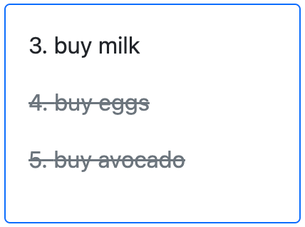
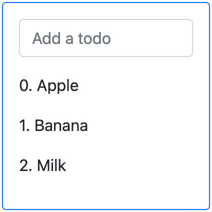
5. A list of todos
Now, let us display a list of todos instead of just one todo. For now, we can still hard-code the list.
Exercise
Change the code to display a list of todos instead of just one, and use t-foreach in the template.
Think about how it should be keyed with the
t-keydirective.
6. Adding a todo
So far, the todos in our list are hard-coded. Let us make it more useful by allowing the user to add a todo to the list.
Exercise
Add an input above the task list with placeholder Enter a new task.
Add an event handler on the
keyupevent namedaddTodo.Implement
addTodoto check if enter was pressed (ev.keyCode === 13), and in that case, create a new todo with the current content of the input as the description.Make sure it has a unique id. It can be just a counter that increments at each todo.
Then, clear the input of all content.
Bonus point: don’t do anything if the input is empty.
Note
Notice that nothing updates in the UI: this is because Owl does not know that it should update
the UI. This can be fixed by wrapping the todo list in a useState hook.
this.todos = useState([]);
See also
7. Focusing the input
Let’s see how we can access the DOM with t-ref and useRef.
Exercise
See also
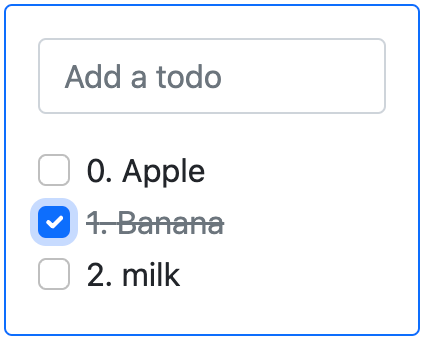
8. Toggling todos
Now, let’s add a new feature: mark a todo as completed. This is actually trickier than one might
think. The owner of the state is not the same as the component that displays it. So, the Todo
component needs to communicate to its parent that the todo state needs to be toggled. One classic
way to do this is by using a callback prop toggleState.
Exercise
Add an input with the attribute
type="checkbox"before the id of the task, which must be checked if the statedoneis true.Add a callback props
toggleState.Add a
clickevent handler on the input in theTodocomponent and make sure it calls thetoggleStatefunction with the todo id.Make it work!
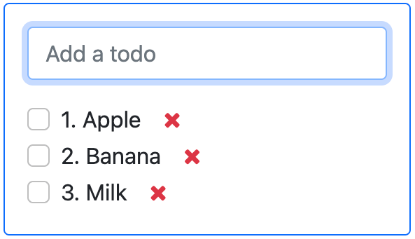
9. Deleting todos
The final touch is to let the user delete a todo.
Exercise
Add a new callback prop
removeTodo.
Tip
If you’re using an array to store your todo list, you can use the JavaScript splice function
to remove a todo from it.
// find the index of the element to delete
const index = list.findIndex((elem) => elem.id === elemId);
if (index >= 0) {
      // remove the element at index from list
      list.splice(index, 1);
}
Insert
<span class="fa fa-remove">in the template of theTodocomponent.Whenever the user clicks on it, it should call the
removeTodomethod.
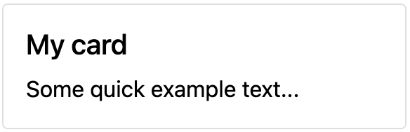
10. Generic components with slots
Owl has a powerful slot system to allow you to write generic components. This is useful to factorize the common layout between different parts of the interface.
Exercise
Write a
Cardcomponent using the following Bootstrap HTML structure:<div class="card" style="width: 18rem;"> <img src="..." class="card-img-top" alt="..." /> <div class="card-body"> <h5 class="card-title">Card title</h5> <p class="card-text"> Some quick example text to build on the card title and make up the bulk of the card's content. </p> <a href="#" class="btn btn-primary">Go somewhere</a> </div> </div>
This component should have two slots: one slot for the title, and one for the content (the default slot).
Example
Here is how one could use it:
<Card>
   <t t-set-slot="title">Card title</t>
   <p class="card-text">Some quick example text...</p>
   <a href="#" class="btn btn-primary">Go somewhere</a>
</Card>
Bonus point: if the
titleslot is not given, theh5should not be rendered at all.
11. Go further
Exercise
Add prop validation on the
Cardcomponent.Try to express in the props validation system that it requires a
defaultslot, and an optionaltitleslot.