Chapter 3: Fields and Views
In the previous chapter, we learned a range of skills, including how to create and use services, work with the Layout component, make the dashboard translatable, and lazy load a JavaScript library like Chart.js. Now, let’s move on to learning how to create new fields and views.

This is the progress that we have made in discovering the JavaScript web framework at the end of Chapter 2: Flectra web framework.
Fields and views are among the most important concepts in the Flectra user interface. They are key to many important user interactions, and should therefore work perfectly.
In the context of the JavaScript framework, fields are components specialized for visualizing/editing a specific field for a given record.
For example, a (Python) model may define a char field, which will be represented by a field
component CharField.
A field component is basically just a component registered in the fields registry. The field component may define some additional static keys (metadata), such
as displayName or supportedTypes, and the most important one: extractProps, which prepare the
base props received by the CharField.
Example
Let us discuss a simplified implementation of a CharField.
First, here is the template:
<t t-name="web.CharField" owl="1">
    <t t-if="props.readonly">
        <span t-esc="formattedValue" />
    </t>
    <t t-else="">
        <input
            class="o_input"
            t-att-type="props.isPassword ? 'password' : 'text'"
            t-att-placeholder="props.placeholder"
            t-on-change="updateValue"
         />
    </t>
</t>
It features a readonly mode and an edit mode, which is an input with a few attributes. Now, here is the JavaScript code:
export class CharField extends Component {
    get formattedValue() {
        return formatChar(this.props.value, { isPassword: this.props.isPassword });
    }

    updateValue(ev) {
       let value = ev.target.value;
       if (this.props.shouldTrim) {
           value = value.trim();
       }
       this.props.update(value);
    }
}

CharField.template = "web.CharField";
CharField.displayName = _lt("Text");
CharField.supportedTypes = ["char"];

CharField.extractProps = ({ attrs, field }) => {
    return {
        shouldTrim: field.trim && !archParseBoolean(attrs.password),
        maxLength: field.size,
        isPassword: archParseBoolean(attrs.password),
        placeholder: attrs.placeholder,
    };
};

registry.category("fields").add("char", CharField);
There are a few important things to notice:
The
CharFieldreceives its (raw) value in props. It needs to format it before displaying it.It receives an
updatefunction in its props, which is used by the field to notify the owner of the state that the value of this field has been changed. Note that the field does not (and should not) maintain a local state with its value. Whenever the change has been applied, it will come back (possibly after an onchange) by the way of the props.It defines an
extractPropsfunction. This is a step that translates generic standard props, specific to a view, to specialized props, useful to the component. This allows the component to have a better API, and may make it so that it is reusable.
Fields have to be registered in the fields registry. Once it’s done, they can be used in some
views (namely: form, list, kanban) by using the widget attribute.
Example
<field name="preview_moves" widget="account_resequence_widget"/>
Goal
The solutions for each exercise of the chapter are hosted on the official Flectra tutorials repository.
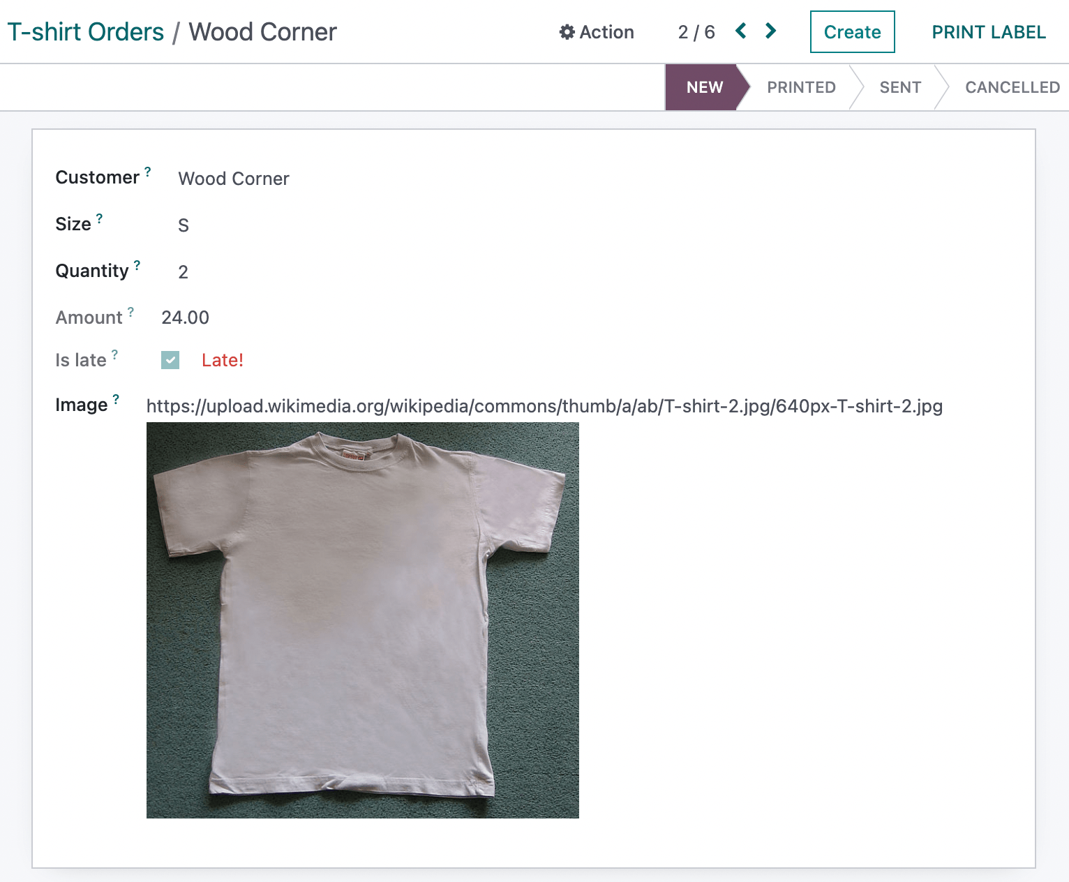
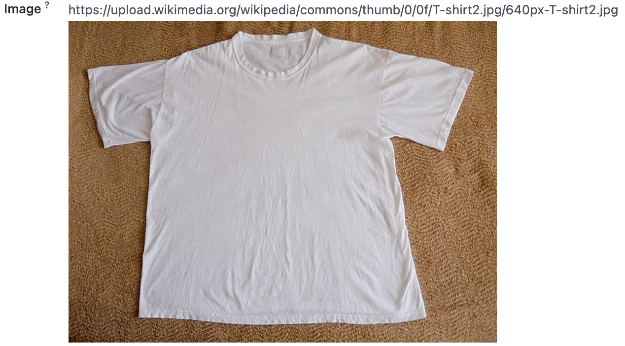
1. An image_preview field
Each new order on the website will be created as an awesome_tshirt.order. This model has a
image_url field (of type char), which is currently only visible as a string. We want to be able
to see it in the form view.
For this task, we need to create a new field component image_preview. This component is
specified as follows: In readonly mode, it is only an image tag with the correct src if the field
is set; In edit mode, it also behaves like classical char fields (you can use the CharField in
your template by passing it in the props). An input should be displayed with the text value of the
field, so it can be edited.
Exercise
Create a new
ImagePreviewcomponent and use theCharFieldcomponent in your template. You can use t-props to pass props received byImagePreviewtoCharField.Register your field in the proper registry.
Update the arch of the form view to use your new field by setting the
widgetattribute.
Note
It is possible to solve this exercise by inheriting CharField , but the goal of this
exercise is to create a field from scratch.
See also
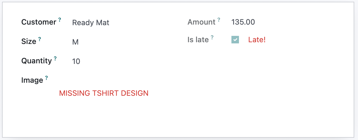
2. Improving the image_preview field
Exercise
We want to improve the field of the previous task to help the staff recognize orders for which some action should be done. In particular, we want to display a warning “MISSING TSHIRT DESIGN” in red if there is no image URL specified on the order.

3. Customizing a field component
Let’s see how to use inheritance to extend an existing component.
There is a is_late, readonly, boolean field on the task model. That would be useful information to
see on the list/kanban/view. Then, let us say that we want to add a red word “Late!” next to it
whenever it is set to true.
Exercise
Create a new
LateOrderBooleanfield inheriting fromBooleanField. The template ofLateOrderBooleancan also inherit from theBooleanFieldtemplate.Use it in the list/kanban/form view.
Modify it to add a red
Latenext to it, as requested.
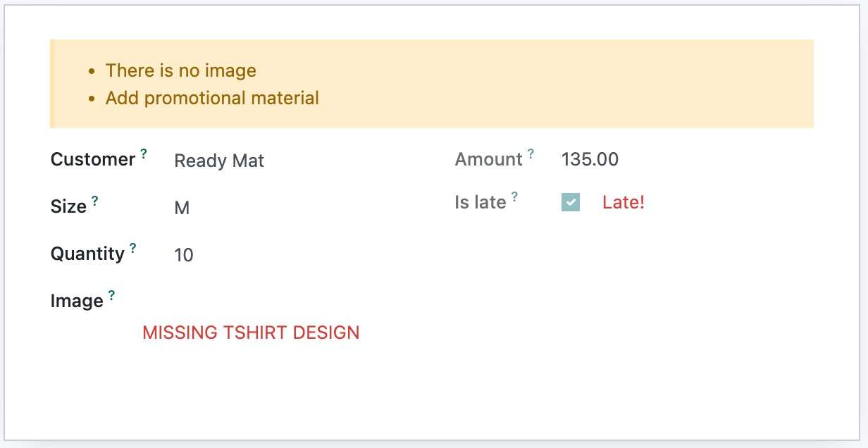
4. Message for some customers
Flectra form views support a widget API, which is like a field, but more generic. It is useful to
insert arbitrary components in the form view. Let us see how we can use it.
Exercise
For a super efficient workflow, we would like to display a message/warning box with some information in the form view, with specific messages depending on some conditions:
If the
image_urlfield is not set, it should display “No image”.If the amount of the order is higher than 100 euros, it should display “Add promotional material”.
Make sure that your widget is updated in real time.
5. Use markup
Let’s see how we can display raw HTML in a template. Before, there was a t-raw directive that
would just output anything as HTML. This was unsafe, and has been replaced by a t-out directive that acts like a t-esc unless
the data has been marked explicitly with a markup function.
Exercise
Modify the previous exercise to put the
imageandmaterialwords in bold.The warnings should be markuped, and the template should be modified to use
t-out.
Note
This is an example of a safe use of t-out , since the string is static.

6. Add buttons in the control panel
Views are among the most important components in Flectra: they allow users to interact with their data. Let us discuss how Flectra views are designed.
The power of Flectra views is that they declare how a particular screen should work with an XML
document (usually named arch, short for architecture). This description can be extended/modified
by xpaths serverside. Then, the browser loads that document, parses it (fancy word to say that it
extracts the useful information), and then represents the data accordingly.
Example
The arch document is view specific. Here is how a graph view or a calendar view could be
defined:
<graph string="Invoices Analysis" type="line" sample="1">
    <field name="product_categ_id"/>
    <field name="price_subtotal" type="measure"/>
</graph>

<calendar string="Leads Generation" create="0" mode="month" date_start="activity_date_deadline" color="user_id" hide_time="true" event_limit="5">
    <field name="expected_revenue"/>
    <field name="partner_id" avatar_field="avatar_128"/>
    <field name="user_id" filters="1" invisible="1"/>
</calendar>
A view is defined in the view registry by an object with a few specific keys.
type: The (base) type of a view (for example,form,list…).display_name: What should be displayed in the tooltip in the view switcher.icon: Which icon to use in the view switcher.multiRecord: Whether the view is supposed to manage a single record or a set of records.Controller: The component that will be used to render the view (the most important information).
Example
Here is a minimal Hello view, which does not display anything:
/** @flectra-module */

import { registry } from "@web/core/registry";

export const helloView = {
   type: "hello",
   display_name: "Hello",
   icon: "fa fa-picture-o",
   multiRecord: true,
   Controller: Component,
};

registry.category("views").add("hello", helloView);
Most (or all?) Flectra views share a common architecture:

The view description can define a props function, which receives the standard props, and computes
the base props of the concrete view. The props function is executed only once, and can be thought
of as being some kind of factory. It is useful to parse the arch XML document, and to allow the
view to be parameterized (for example, it can return a Renderer component that will be used as
Renderer), but then it makes it easy to customize the specific renderer used by a sub view.
These props will be extended before being given to the Controller. In particular, the search props (domain/context/groupby) will be added.
Then, the root component, commonly called the Controller, coordinates everything. It uses the
generic Layout component (to add a control panel), instantiates a Model, and uses a Renderer
component in the Layout default slot. The Model is tasked with loading and updating data, and
the Renderer is supposed to handle all rendering work, along with all user interactions.
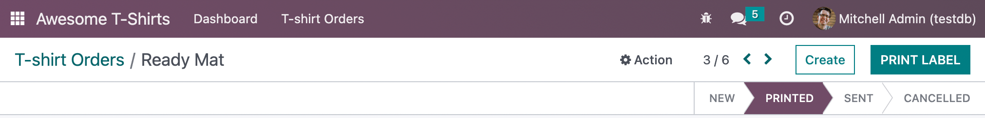
In practice, once the t-shirt order is printed, we need to print a label to put on the package. To do that, let us add a button in the order form view control panel which will call a model method.
There is a service dedicated to calling models methods: orm_service, located in
core/orm_service.js. It provides a way to call common model methods, as well as a generic
call(model, method, args, kwargs) method.
Example
setup() {
    this.orm = useService("orm");
    onWillStart(async () => {
        // will read the fields 'id' and 'descr' from the record with id=3 of my.model
        const data = await this.orm.read("my.model", [3], ["id", "descr"]);
        // ...
    });
}
Exercise
Create a customized form view extending the web form view and register it as
awesome_tshirt.order_form_view.Add a
js_classattribute to the arch of the form view so Flectra will load it.Create a new template inheriting from the form controller template to add a button after the create button.
Add a button. Clicking on this button should call the method
print_labelfrom the modelawesome_tshirt.orderwith the proper id. Note:print_labelis a mock method, it only displays a message in the logs.The button should be disabled if the current order is in
createmode (i.e., it does not exist yet).The button should be displayed as a primary button if the customer is properly set and if the task stage is
printed. Otherwise, it is displayed as a secondary button.Bonus point: clicking twice on the button should not trigger 2 RPCs.
7. Auto-reload the kanban view
Bafien is upset: he wants to see the kanban view of the tshirt orders on his external monitor, but the view needs to be up-to-date. He is tired of clicking on the refresh icon every 30s, so he tasked you to find a way to do it automatically.
Just like the previous exercise, that kind of customization requires creating a new JavaScript view.
Exercise
Extend the kanban view/controller to reload its data every minute.
Register it in the view registry, under
awesome_tshirt.autoreloadkanban.Use it in the arch of the kanban view (with the
js_classattribute).
Important
If you use setInterval or something similar, make sure that it is properly canceled when your
component is unmounted. Otherwise, you will introduce a memory leak.