Advanced K: Dashboards
Warning
This tutorial assumes you have completed the Core Training and have access to Flectra Professional features.
To follow the exercise, it is recommended that you fetch the branch 2.0-core from the repository XXX, it contains a version of the module created during the core training we can use as a starting point.
The term “Dashboard” is used in Flectra for objects that display data, but involves different
implementations. This tutorial will only focus on the Professional view that is used to provide
aggregated data visualization. They can be added as a view_mode to an existing model (i.e. a
view you can switch to via the view buttons in the top right of a view), but they are also often
used as a view for to a special model customized for data visualization. You may hear these
special views referred to as SQL views.
It is useful to note there is a “Dashboard” app in Flectra Community. This app allows users to create
their own customized view of data, but the customization is only visible to each user and can
only be viewed within the “Dashboard” app. Technically it is possible to make global dashboards
using this board module, but it is much easier to do as an Professional view. Plus it looks nicer
and has extra features not available in board. Some other dashboards within Flectra also exist,
but they are custom made and are beyond the scope of this tutorial.
The documentation related to this topic can be found in Dashboard.
File Structure
You probably have already guessed that since dashboard views are an Professional view, they must have
a dependency on an Professional module. The Professional module is web_dashboard. Don’t forget to
add it to your manifest file! It is standard to add dashboards intended to be used as a
view_mode for one of your module’s models (in the model folder``) to the views directory
(i.e. the same file that contains the other views for the same model).
It is standard to create a separate Professional module to add extra Professional views and features to
a Community module. This is done in a similar manner as the module link technique covered within
Chapter 14: Interact With Other Modules. The difference is that instead of linking 2 different
modules, we are extending our estate module. We do this by creating a new module and adding both
the Community module and its necessary Professional module dependencies to its manifest. You will
commonly see “Professional” in the module’s directory name. To keep this tutorial simple, we will
add dashboards to our existing estate module.
SQL Views have 2 parts: their xml file (don’t forget to add it to your manifest file) and their
Python file (don’t forget to add it to the appropriate __init.py__ files). The former is the
same format as the view_mode xml while the latter contains a custom model and SQL code to
populate its fields. It is standard to add SQL view files to the report/ directory. It
is also common to include “report” in the name of the SQL view’s files. You may be
wondering why do we put the files in a report directory? We saw earlier that the dashboard is
for data visualization, therefore it is not editable. You can think of dashboards as interactive
reports where you can click on statistics, graphs, and charts to see the specific data contributing
to them. Note it is also standard to store the xml code for
It is expected that your work tree will look something like:
estate
├── models
│   ├── *.py
│   └── __init__.py
├── report
│   ├── __init__.py
│   ├── estate_report.py
│   └── estate_report_views.xml
├── security
│   └── ir.model.access.csv
├── views
│   ├── *.xml
│   └── estate_property_views.xml
├── __init__.py
└── __manifest__.py
Dashboard View
Note
Goal: at the end of this section, we will have a new dashboard view that displays different property statistics.
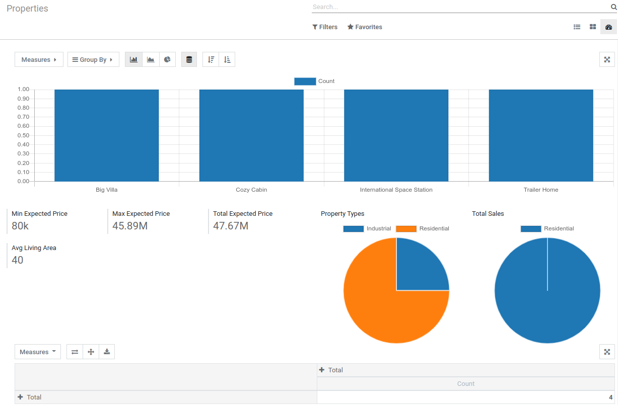
Dashboards can display data in different ways, including:
showing an
aggregateof a fieldusing aggregated fields in a
formulausing a
widgetusing another
viewas a subview
Data
To fully enjoy our dashboard view, we will need good test data to populate it. Test data will allow us to check that the resulting look and statistics are correct. It is a good idea to test with data that will cover most or all of your expected use cases, but is also easy to verify with that your statistics are correct. In our goal’s case we are looking at count, sum, average, minimum, and maximum statistics, therefore a good representation set for our dashboard is:
At least 3 properties with different property types, expected prices, and average living area.
At least 1 sold property and at least 1 canceled property
If you don’t have a set of data like this already, you can either:
Complete Advanced C: Master and Demo Data (if you haven’t done so already) and add the extra cases to your demo data (you may need to create a new database to load in the demo data).
Manually create the data in your database.
Copy this data file into a new directory called
datain your estate module and copy these lines into your __manifest__.py file (you may need to create a new database to load in the demo data).
Click through your database data and make sure it is what you expect. Of course you can add the data after you write your dashboard code and then test that your view is working as expected.
Aggregations
Building a dashboard view is very similar to what you have previously done in
Chapter 7: Basic Views. For the dashboard view, we use the dashboard root element
and choose from its possible tags (see all the possibilities and their attributes in the
Dashboard documentation). So a simple dashboard example is:
<dashboard>
    <group>
        <aggregate name="min_expected_price" string="Min Expected Price" field="expected_price"
            group_operator="min" help="Lowest expected price."/>
    </group>
</dashboard>
In this example, <group> adds styling and <aggregate> declares an aggregation. We
indicate which field we want to aggregate, what string to display with the value, and
how to aggregate it with the group_operator attribute. The group_operator can use any valid
PostgreSQL aggregate function plus the special Flectra defined count_distinct.
Hopefully you remember how to add views to a window action view_mode (hint, it was
covered in Chapter 6: Finally, Some UI To Play With). Now let’s make some dashboards!
Exercise
Make a dashboard view.
Create a dashboard of aggregated values for the
estate.propertymodel. You can look at the Goal of this section for some inspiration. Remember to check that your statistics are calculating as you expect and note that the calculated values take into consideration any applied view filters!Bonus: Add in some aggregations that need a
domainto make sense (remember domains were also covered in Chapter 7: Basic Views).
Pie Charts
Adding pie charts to dashboards is a piece of cake using the <widget> element. An example is:
<dashboard>
    <group>
      <widget name="pie_chart" title="Property Types" attrs="{'groupby': 'property_type_id'}"/>
    </group>
</dashboard>
In this example, we indicate that we’re using the pie_chart widget with the name attribute,
the title for the pie chart, and that we’re grouping it by property type.
Exercise
Add some pie charts.
Add the pie charts from the Goal of this section to your dashboard. Hint: you will need to add
'measure': selling_priceto your pie chartattrsif you want to show selling prices grouped by property type.Hover over and click on the pie charts to check your charts counts values and don’t forget that filters will also apply to the charts.
Bonus: Add a domain to your selling price pie chart to only include “sold” properties (i.e. not “offer_accepted” ones). Note that the
'will need to be escaped since it is declared as part of theattrs.
Subviews
Similar to how we can use the list view within the form view (we saw this automatically happen for One2many relationships in Chapter 8: Relations Between Models), we can add other views within our dashboard view. The most commonly added are the pivot and graph views, but the cohort view is also an option. These views are covered in more depth in Advanced H: Advanced Views. For this topic you are only required to know their names. A dashboard with only subviews is:
<dashboard>
    <view type="graph"/>
    <view type="pivot"/>
</dashboard>
The ref attribute can be added to <view> elements to use a specific xml id for that view. If
no xml id is provided for a graph or pivot view then the default view will be used.
The cohort view will not work in the dashboard without a specific xml id. If you have already
created some of these views then you are welcome to add them to your dashboard! Sample graph and
pivot views are included in the
solution code
that you are welcome to use as well.
Exercise
Add subviews.
Add in a graph and a pivot view to your dashboard. Try playing around with the layout of your subviews in relation to your pie charts and aggregated values and refer to the Goal of this section for an often used layout. Remember to check that your subviews are displaying your data as expected (and yes, they are also affected by the filters!).
SQL Views
Warning
This section expects you to have a basic knowledge of SQL. If you have little to no SQL knowledge then this is a good tutorial to start with and these exercises are good for those who need a refresher or extra practice.
Note
Goal: at the end of this section, we will have a new SQL view that displays different property statistics.
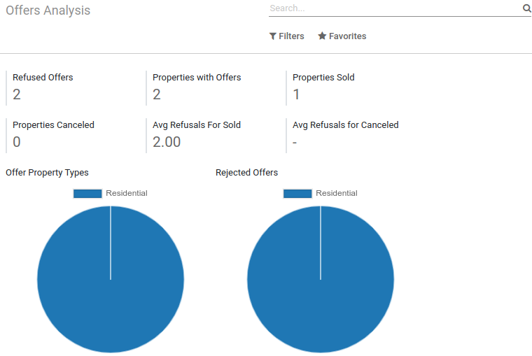
Occasionally we want to show data that goes beyond what our model already has in it. We could add a lot of stored computed or related fields (non-stored fields cannot be aggregated or displayed in pie charts), but it would be impractical to store a bunch of fields only for this purpose. We can instead add a custom SQL view to minimize the computational load and keep our model clean of unnecessary fields.
Model
We will start with the more difficult part: our special report model. This file starts the same as
any other model except that we add 2 attributes _auto and _rec_name:
from flectra import fields, models, tools


class EstateReport(models.Model):
    _name = 'estate.report'
    _description = "Stock Report"
    _rec_name = 'id'
    _auto = False
_auto = False indicates that we do not want to store the model in the database and we will
create a custom table by overriding the BaseModel.init() method. _rec_name indicates
which of the model’s fields represents a record’s name (i.e. the name that will be used in the
navigation breadcrumb when opening a record’s form view). In this case I left it as ‘id’ because
our property offers don’t have a name. We will need the tools import later (i.e.
flectra/flectra/tools, which is full of all sort of useful helper methods you will probably use in
the future). Note that it is standard to include report in the model name.
Remember your new model will need to be added to your security file like you learned in Chapter 5: Security - A Brief Introduction!
Then we define the fields we need for our dashboard the same way as any other model (like you
learned in Chapter 4: Models And Basic Fields), except that every field is
readonly=True. After all, our model is for readonly purposes only.
Now we override the BaseModel.init() method mentioned earlier:
def init(self):
    tools.drop_view_if_exists(self.env.cr, self._table)
    self.env.cr.execute("""CREATE or REPLACE VIEW %s as (
                           SELECT
                              %s
                           FROM
                              %s
          )""" % (self._table, self._select(), self._from()))
We use tools.drop_view_if_exists to ensure that we don’t create a conflicting view and then
execute the SQL query. It is standard to separate the different parts of the query to
allow for easier model extension. Exactly how the query is split up across methods is not
standardized, but you will often see at minimum _select and _from methods [or something
similar] and of course all of these methods will return strings. The columns from the SELECT
will populate our model’s fields so ensure that your column names match your field names
or use alias names that match.
Exercise
Create report model.
Create a report model with the following fields:
Field
Type
Note
id
Integer
Corresponds to
idofestate.property.offeroffer_state
Selection
Equals
statechoices ofestate.property.offerproperty_id
Many2one
estate.propertyproperty_state
Selection
Equals
statechoices ofestate.propertyproperty_type_id
Many2one
estate.property.typeand write the SQL query necessary to populate the fields (hint, you will need 2 JOINs).
You won’t be able to check if your model is correct until we create a view for it, but you are welcome to check your query directly in your database to see if the results are as you expect. If you struggle with this exercise, then here is an example to reference.
View
Now that we have our model, we can make its dashboard view. There is no difference to how its made
except that its file is located in the report folder. Since it is a new model not linked to
any other model, we will also have to add a new menuitem to view our dashboard. Typically SQL views
are added under a first level menu called Reporting` (because it's a report, surprise!). Do you
remember how to add a ``menuitem? If not, revisit Chapter 6: Finally, Some UI To Play With) again.
Exercise
Create report view.
Recreate the dashboard in the Goal of this section. Hint: it uses the
formulaelement, which we did not need for our previous dashboard.Bonus: Create
listandformviews for your new report model so we don’t have to see the ugly defaults when you click on your pie charts.
Extra Tips
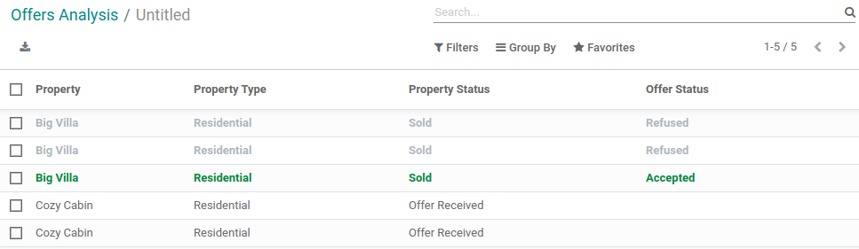
Tip 1 A common mistake in SQL views is to not take into account the duplication of certain data due to table JOINs. For example, in our Goal we have a pie chart of the offers’ property types. We may be tempted to add a similar pie chart with a domain to only include canceled properties, so we think we are only counting the number of canceled properties by property type. In reality we are still looking at all the offers per property so any property with more than 1 offer will be counted per offer. This example is easily double checked by clicking on the pie chart to see its list view:
But for cases such as average aggregations or using a subview such as the pivot view, it is easy to miss this mistake. It is also easy to miss this mistake when you have insufficient test data. In order to add a number of properties canceled by property type pie chart to this report, we would either have to do a hack (too advanced for this tutorial) or simply exclude it from this report.
Tip 2 If you have a field that you do not want as a measure (i.e. in your pivot or
graph views), then you can add store=False to it and it will not show.